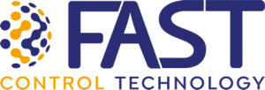
Fast has created a new modern and dynamic image to consistently communicate its values and its mission. This renewal operation moves from the graphic restyling of the logo, realized by working on form, style, and typeface and will continue with the updating of the entire corporate image.
Maintaining the distinctive colors of the company, blue and orange, in the new version of the brand, the pictogram is completely revised: the concept of the globe is re-proposed in a more stylized way, which becomes a world of connections, a network of services and interactions, the expression of the capillarity and diversification of Fast services.A reworking of the graphics font gives the lettering a more up-to-date character, the letters no longer merged into one another, are touching and elegantly create a continuity of clear and immediate reading.